
speakeasy
UI/UX END-TO-END LANGUAGE EXCHANGE MOBILE APP
SpeakEasy is a language learning app that connects users with compatible native speakers, fostering meaningful learning through social interaction.
background
The number of language learners worldwide has steadily increased, with an estimated 1.5 billion actively learning foreign languages.
PROBLEM AREA: Language learners often feel unprepared to apply their knowledge in real-world scenarios due to limited exposure to authentic conversational practice, as most studies still take place in traditional in-class environments.
goal
Encourage *language exchange by helping learners connect with native speakers so they can build confidence in real-life conversations through meaningful social interactions.
*Language exchange is an activity in which two people take turns teaching each other their native languages to improve speaking and comprehension skills.
IDENTIFY THE MAIN CHALLENGE OF LANGUAGE LEARNING BASED ON USER INSIGHTS AND ANALYSIS.
research
I wanted to understand the successful and unsuccessful experiences of language learners.
I aimed to identify language learners' pain points and needs to improve, and offer
a more effective language exchange platform.
Survey (22 participants who have learned new languages before)
User Interview (4 participants who have done Language Exchange before) + Affinity Map
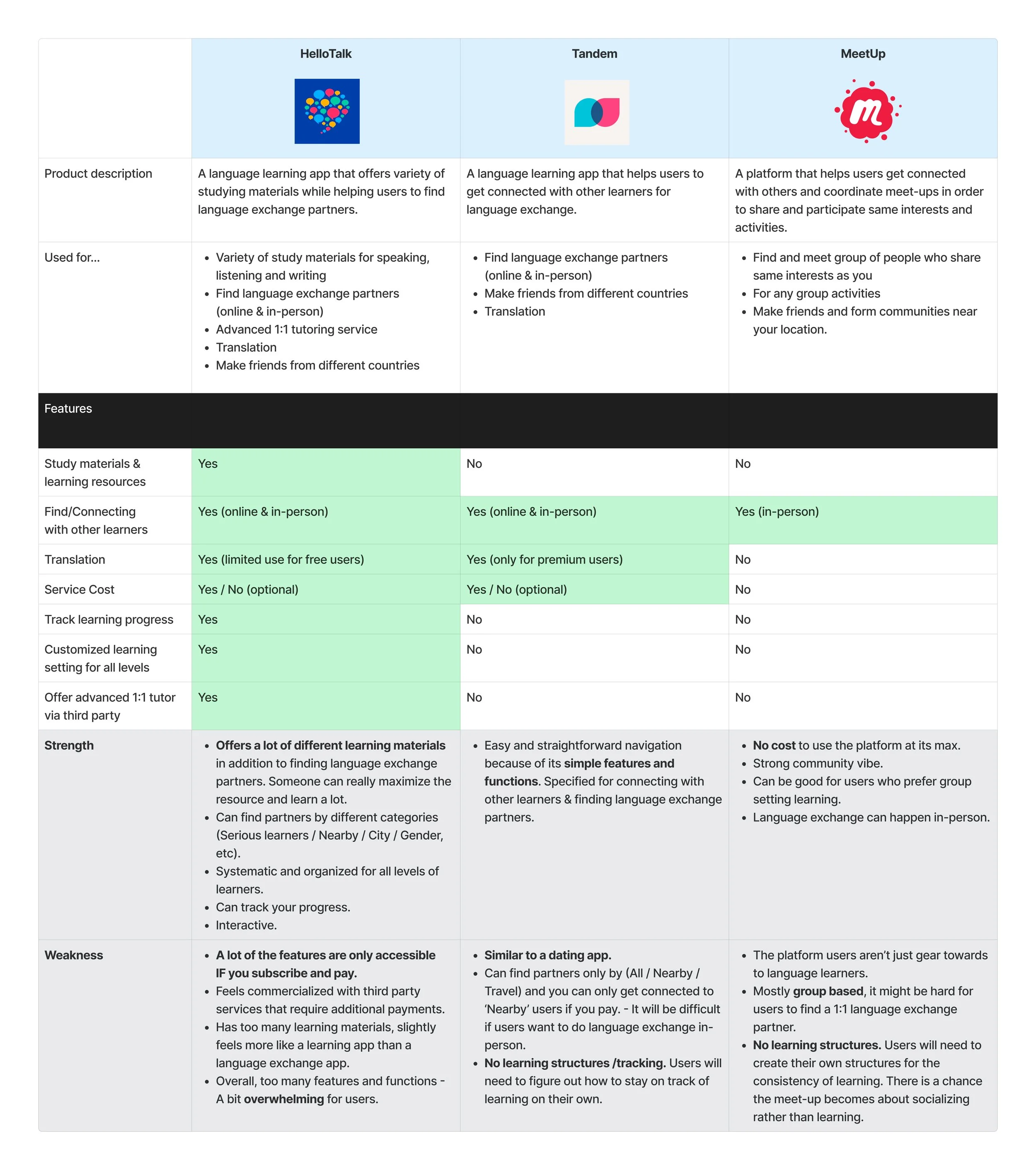
Competitive Analysis (Among 3 current existing Language Exchange platforms)
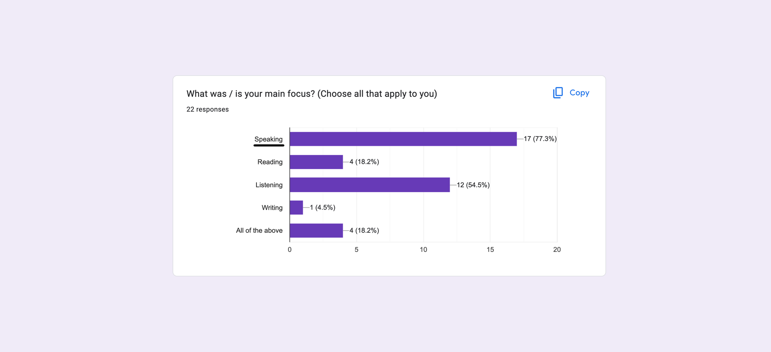


survey + USER INTERVIEW
The survey was conducted with 22 individuals ranging from their early 20s to late 30s, who have either learned a new language before or are currently learning one. More than half of the participants emphasized the importance of exposure and practice with native speakers for improving their speaking skills for:
Real-Life Application
Cultural Context
Instant Correction
Authentic Pronunciation
-
After the survey, I reached out to the four people who answered that they had participated in language exchange to hear about their experiences in depth.
Competitive Analysis: I conducted a competitive analysis to compare and understand the strengths and weaknesses of current language exchange platforms.
-
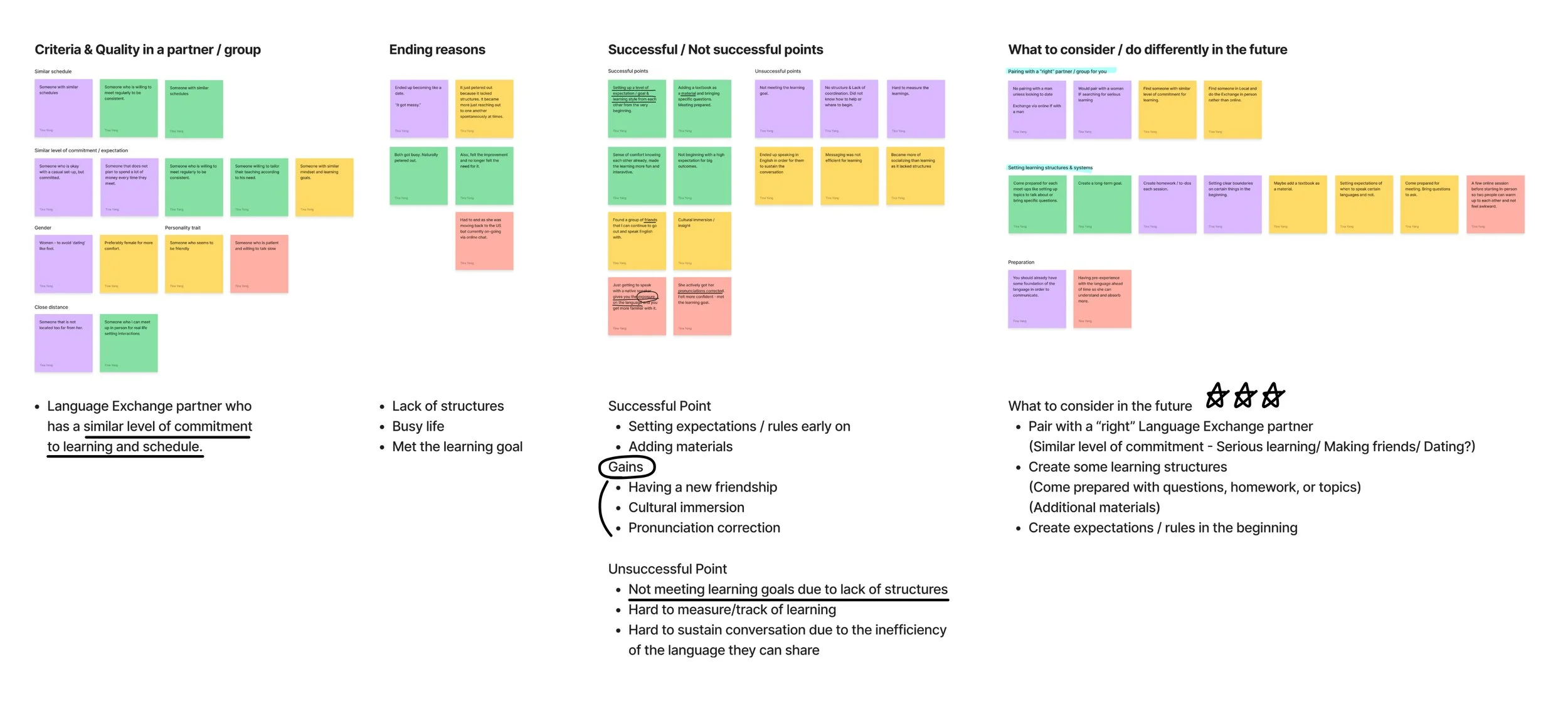
pain points
Sustaining learning through Language Exchange can become difficult due to the lack of structure in each session.
Hard to know other learners’ agenda and level of commitment to learning. (Serious learning? Making friends? Dating?)
Current cost-free Language Exchange platforms resemble dating apps and do not convey a reliable learning environment.
-
AND THESE POINTS LEAD TO…
USER NEEDS
Language Exchange that offers some level of structure or guidance for each learning session.
Language Exchange assists learners in pairing with others who share a similar commitment to learning.
A language exchange platform that offers a reliable learning environment without the need for paid learning materials.
wire frame
After creating a few task flows, I began designing with low-fidelity sketches and mid-fidelity wireframes, focusing on key features based on user needs and pain points.
-
+ FEATURE IDEAS
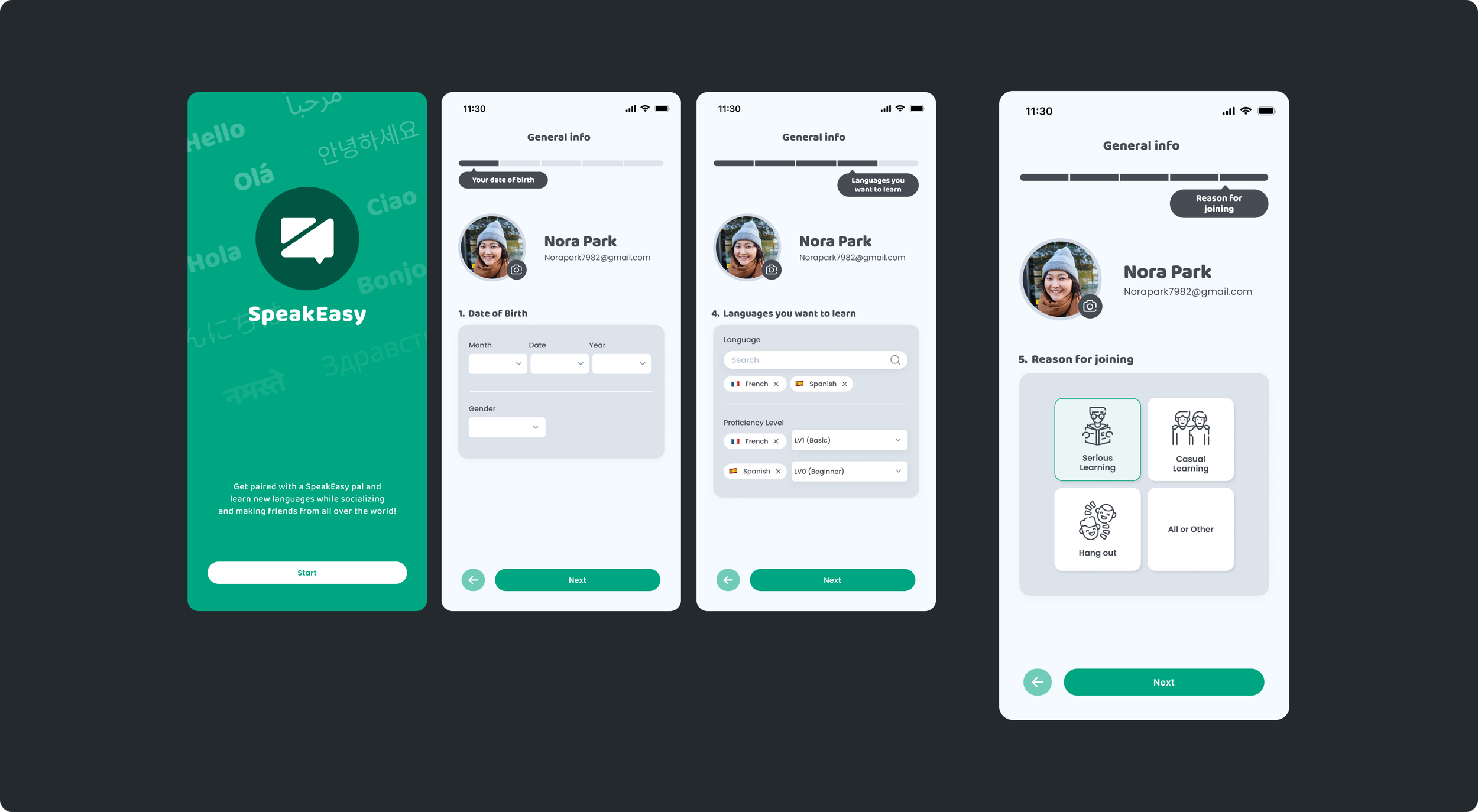
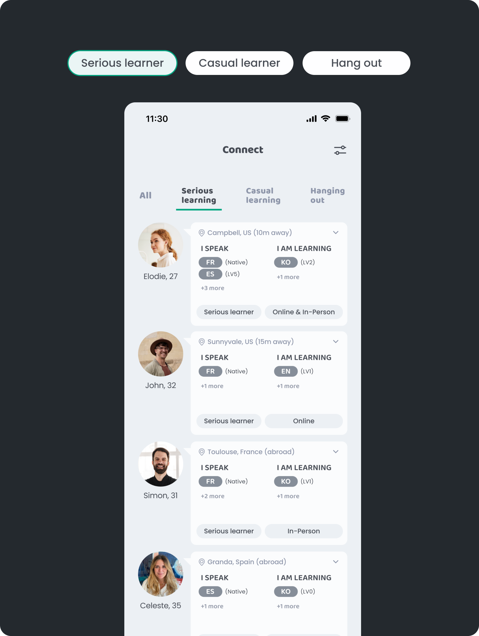
A filter to help users find language exchange partners who match their preferred learner type. (3 Types: Serious learners/ Casual learners/ Hang out)
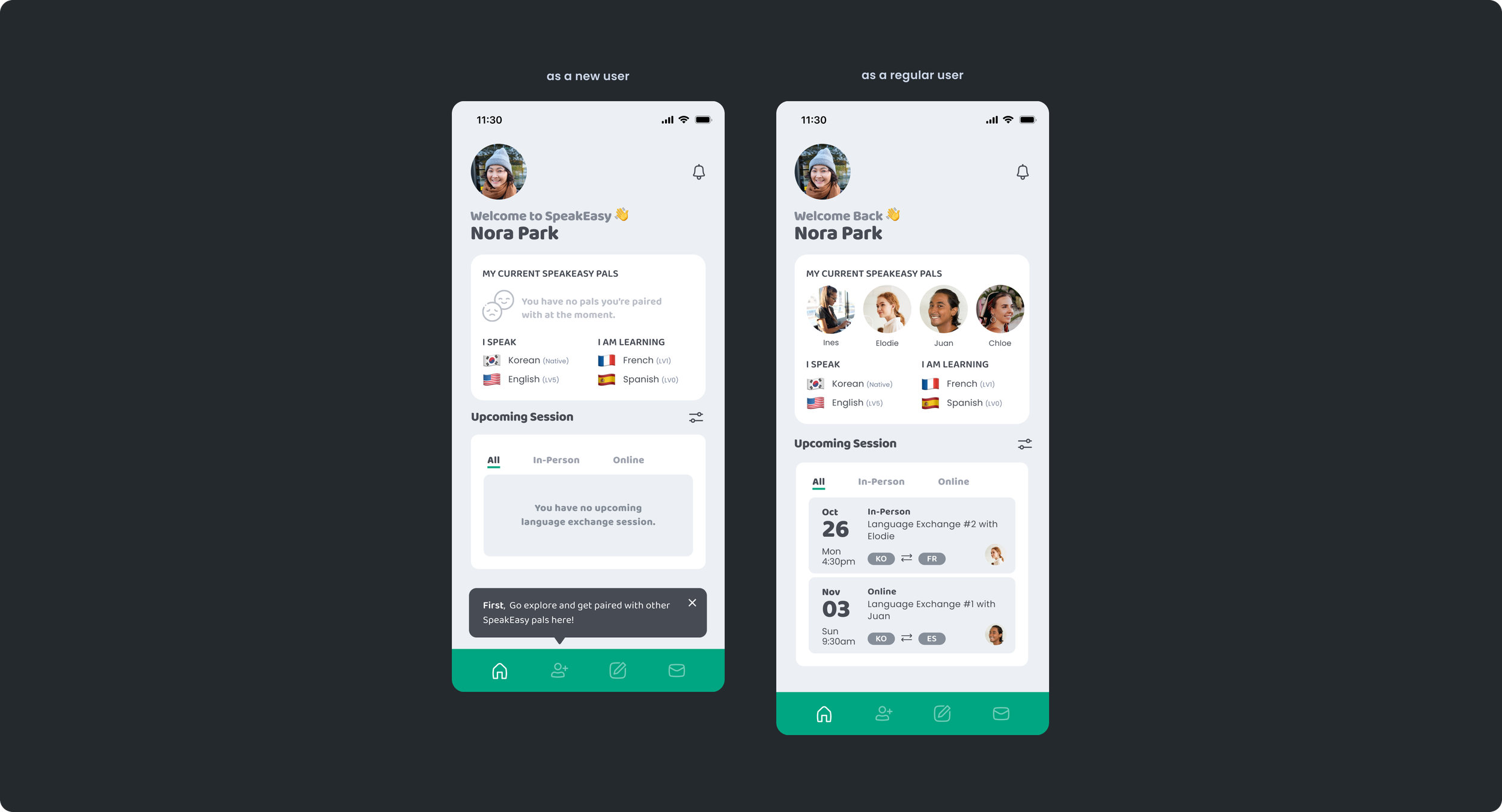
A home screen that shows all upcoming language exchange sessions, helping create a more reliable learning environment while encouraging learners to stay prepared and committed.
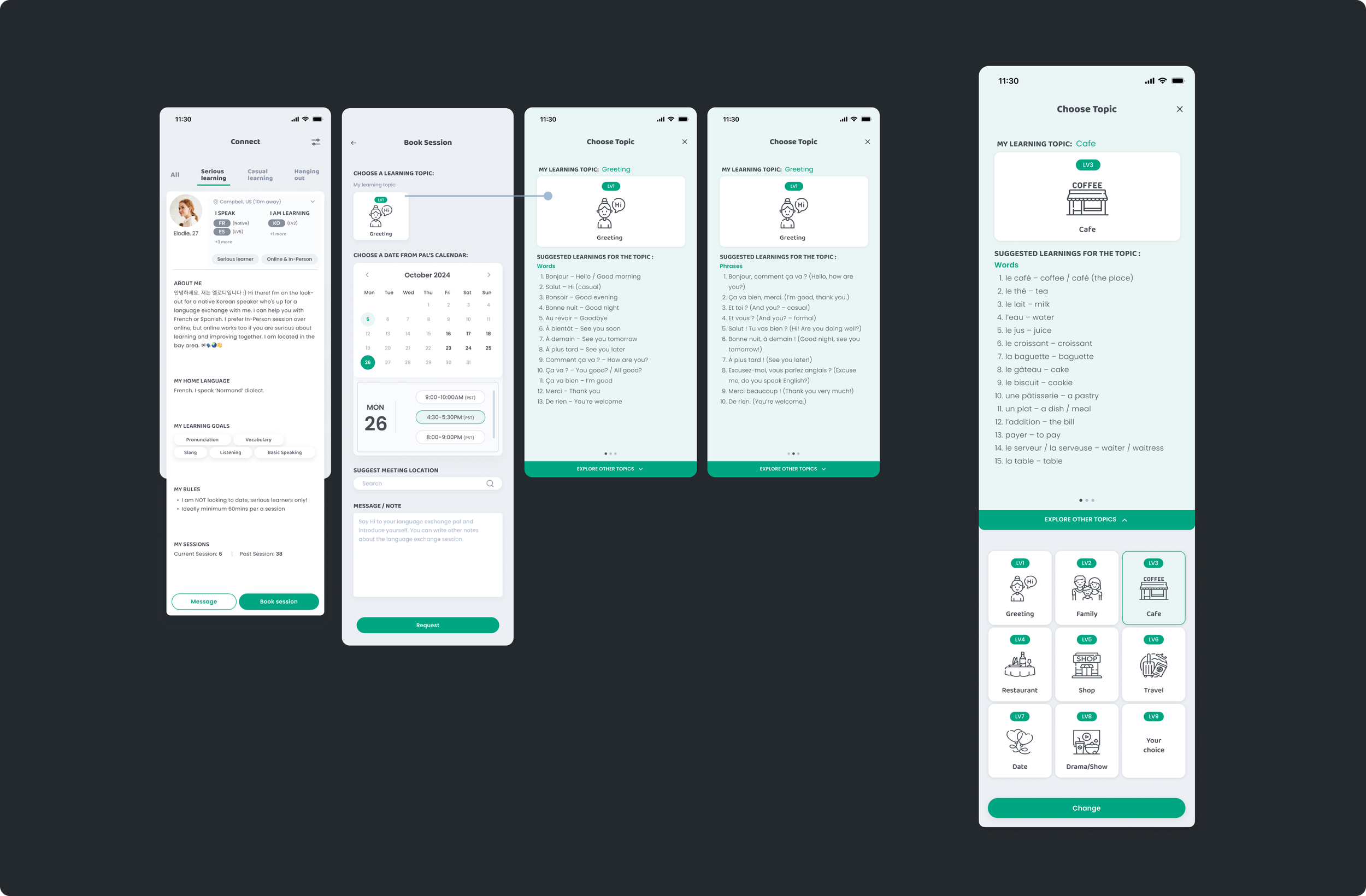
Suggested topics to help guide each session and give learners a basic structure to follow.
A matching screen that pairs users based on preferences like gender, distance, age, and setting (in-person or online).

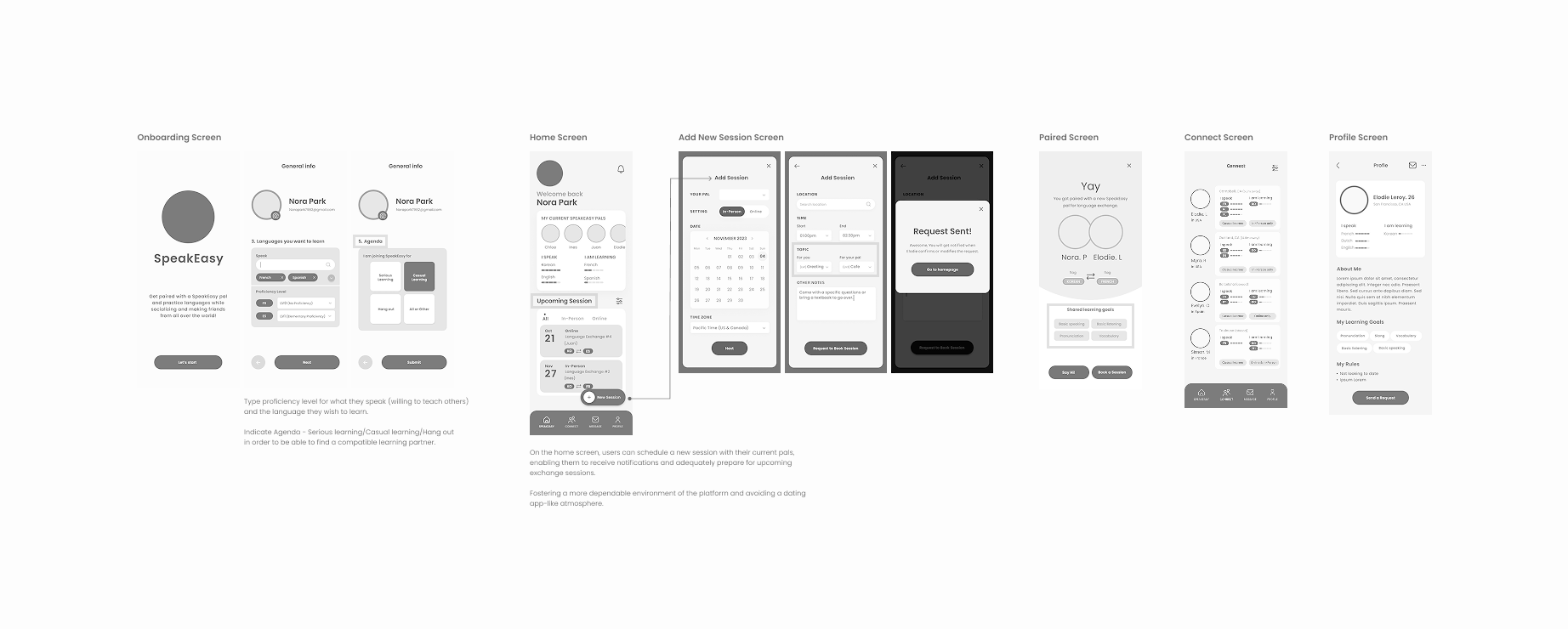
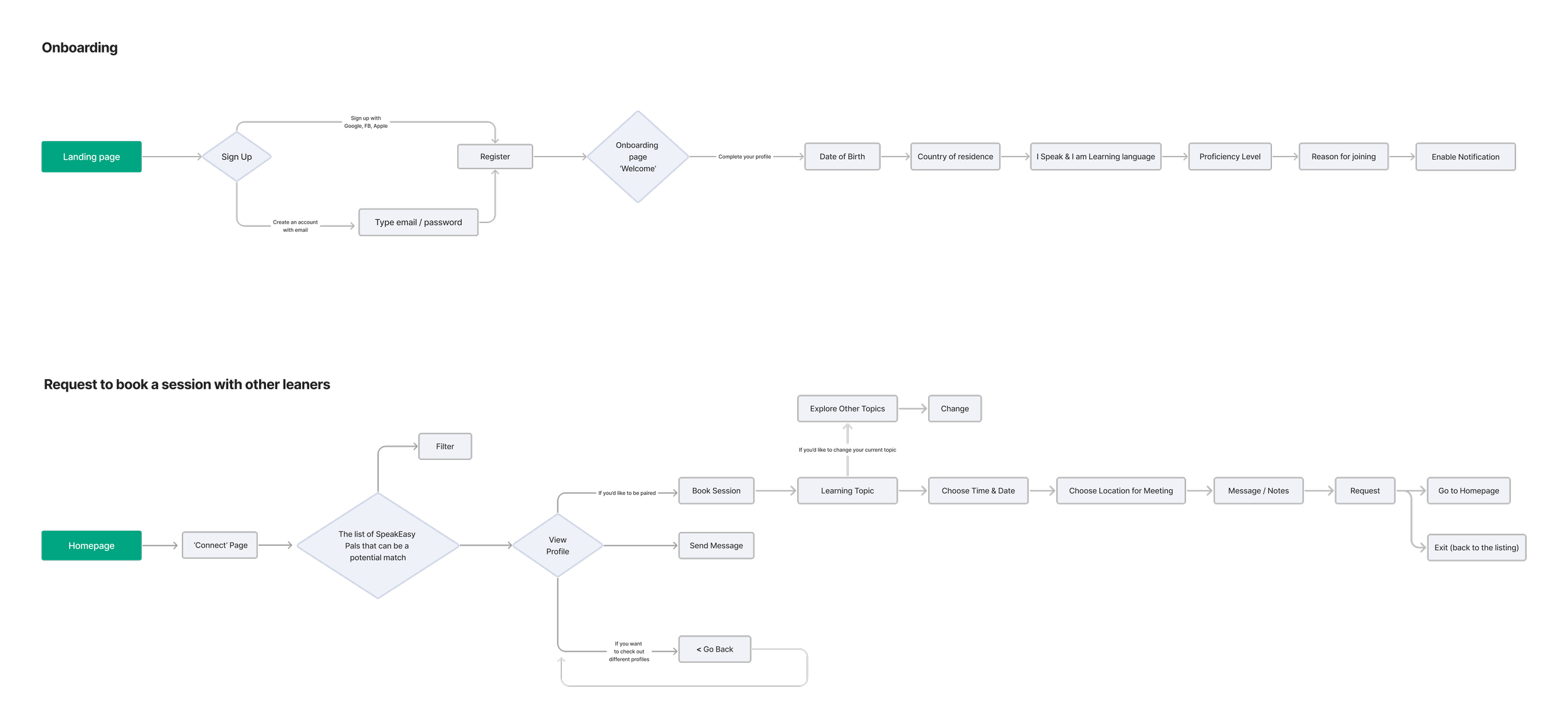
Task flow
Final UI Screens
SOLUTION 01.
Pair learners with others who have a similar commitment to learning.
-
Displays all upcoming language exchange sessions to help create a reliable learning environment and encourage learners to stay prepared and committed.
ONBOARDING SCREEN
CONNECT SCREEN
SOLUTION 02.
Display upcoming language exchange sessions on the home screen.
-
Let users choose a learning topic when booking a session with another learner. Each topic includes a set of words, phrases, and tips to help structure and guide the language exchange session.
HOME SCREEN
SOLUTION 03.
Provide optional learning topics based on users' proficiency levels.
-
Let users select their learner type (Serious learner/ Casual learner/ Hang out) during sign-up and filter by learner type on the Connect screen for better matching.
VIEW PROFILE, BOOK SESSION, LEARNING TOPIC SCREENS


Prototype
TEST, GATHER FEEDBACK, REFINE AND IMPROVE...REPEAT!
user testing & Iterations
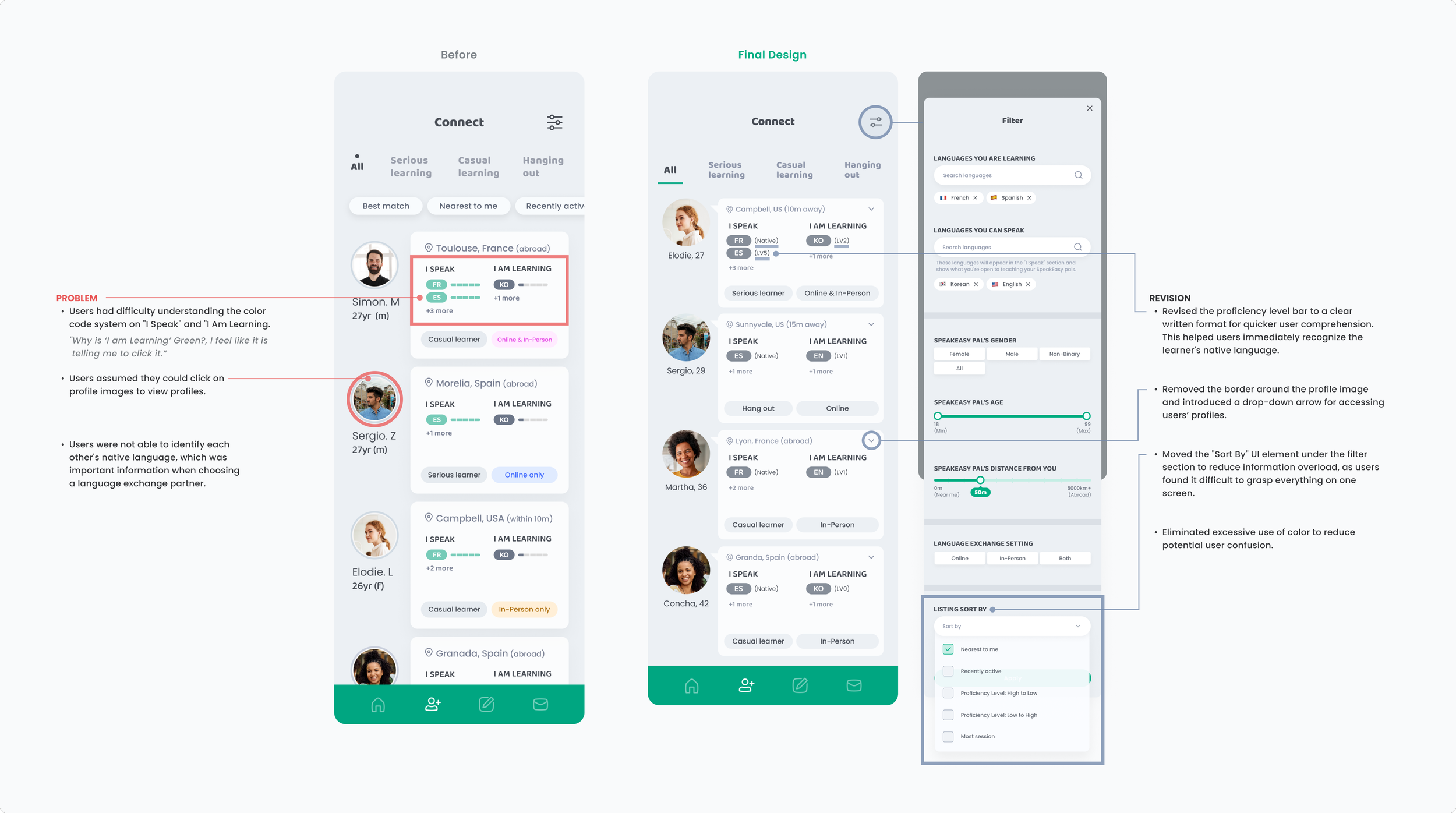
Conducted usability testing and grouped the feedback into four sections: What Worked, What Needs Improvement, Questions, and New Ideas. While there was a lot of helpful feedback, I focused on a few key areas to improve in the next design round.
-

MAIN FEEDBACK
WHAT WORKS
Overall navigation is intuitive and works well.
The app’s purpose—creating a social but focused learning environment—comes through clearly.
The “Suggested Learning Topic” feature is helpful.
The filter system effectively matches users by learning type.
WHAT DOES NOT WORK
The Connect screen has too much information to process.
The color code system on the learner’s profile cards is confusing.
Users want to see more information about each person, such as their native language and dialect.
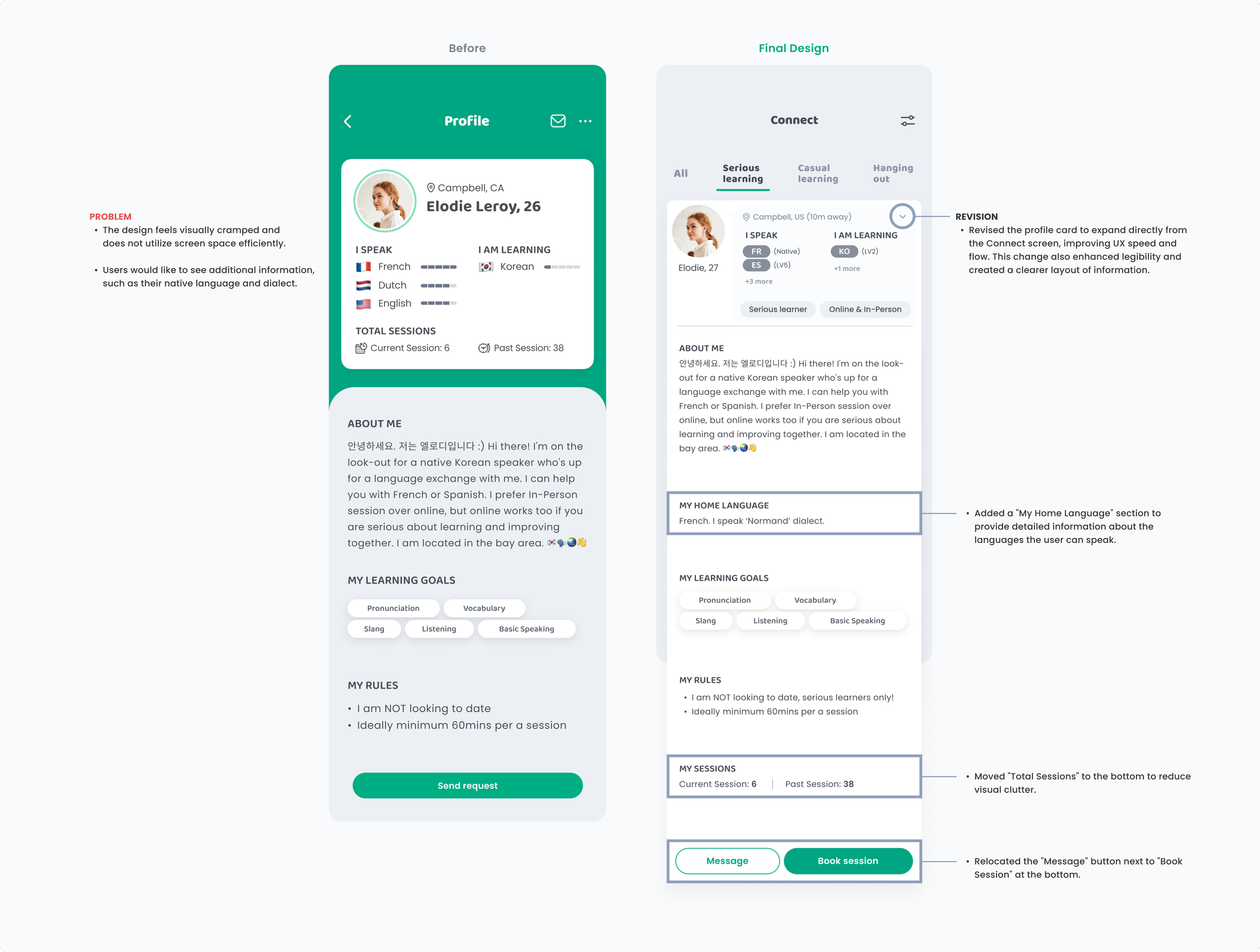
What I Learned
01. THE IMPORTANCE OF INTENTIONAL COLOR USE
Throughout this project, I learned the importance of being intentional with color choices. Initially, I used a wide range of colors to differentiate between various pieces of information. However, I realized that too many colors can overwhelm users, create confusion, and ultimately disrupt the visual hierarchy. It also made my design system feel inconsistent and fragmented. This experience taught me to approach color more strategically—using it sparingly and meaningfully to enhance clarity, maintain cohesion, and support accessibility.
02. THE VALUE OF FEEDBACK AND CRITIQUE
I also learned the importance of regularly sharing my work with fellow designers and potential users. Opening up my design process to feedback—even when it was direct or critical—challenged me to view my work from new perspectives. These conversations helped me better articulate my design decisions and uncover blind spots I hadn’t noticed. As a result, I was able to improve both the quality of my work and my ability to think more critically and objectively as a designer.